Overview
Shasta Ventures was in a period of transition with some parting partners and refined focus on Series A investments. In partnership with Great Monday, a strategy & culture consultant, I led the brand identity, web design and guideline work to help Shasta position themselves for growth.
Solution
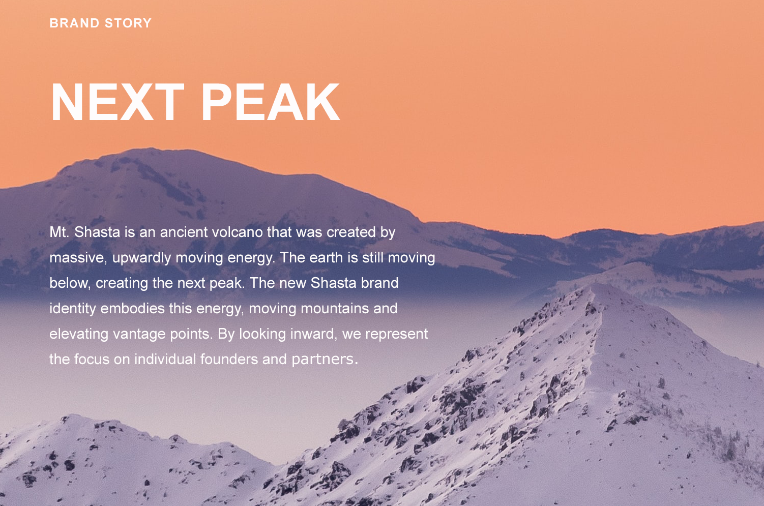
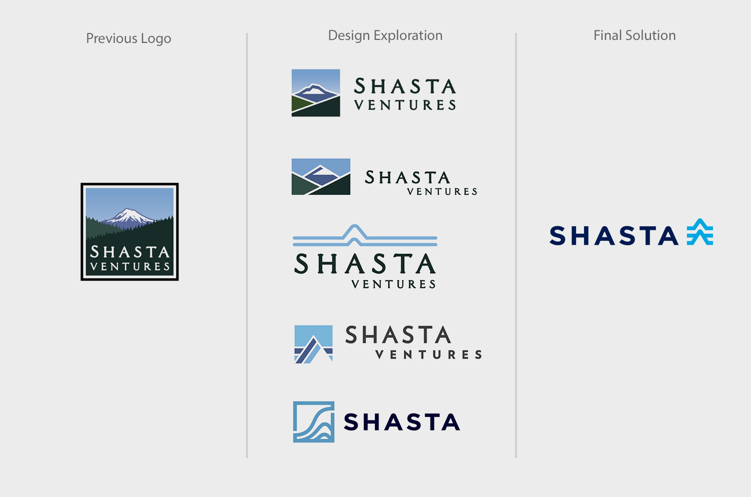
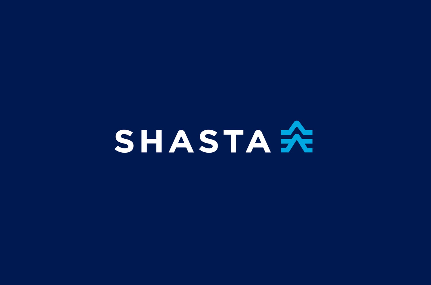
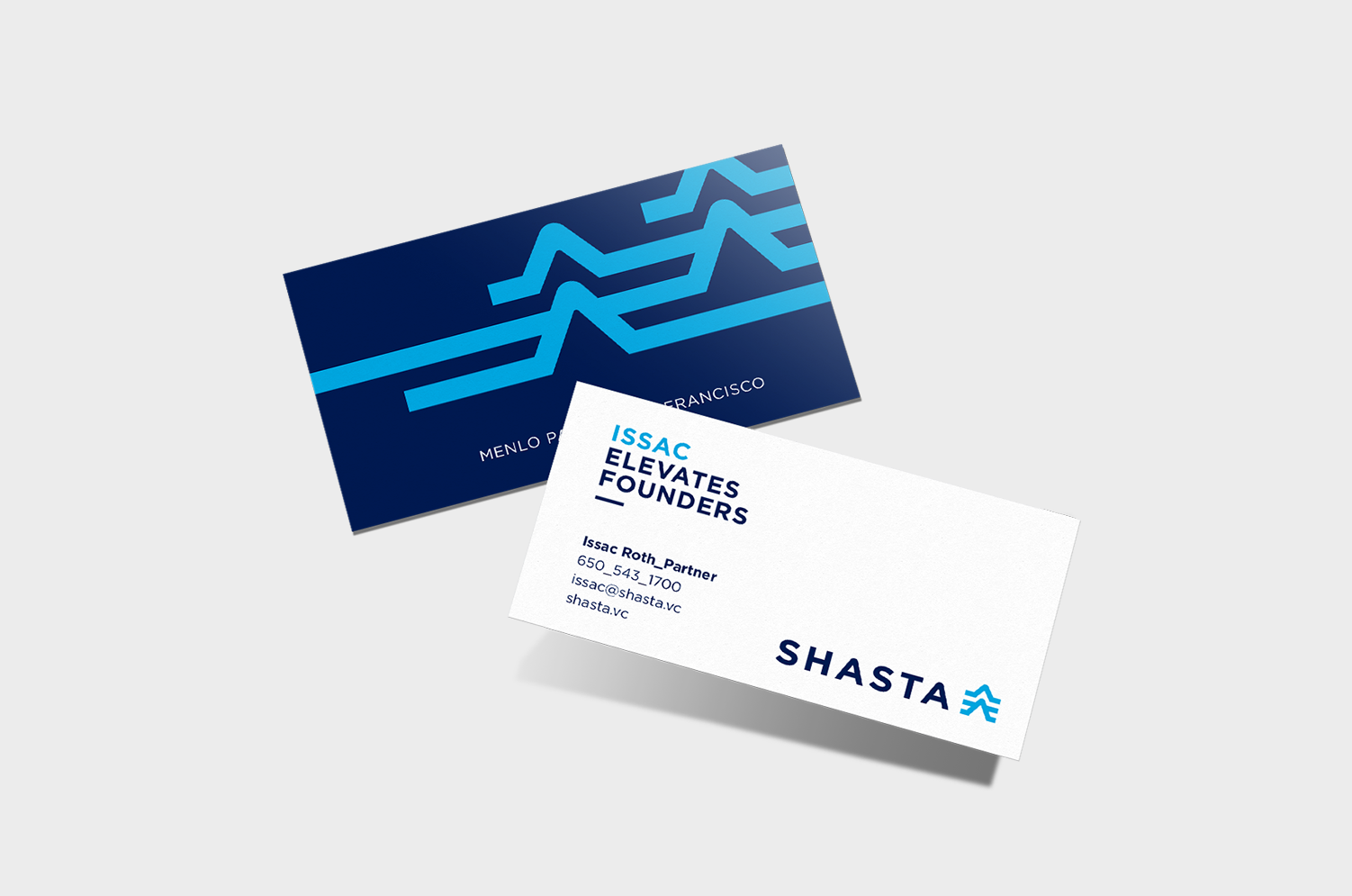
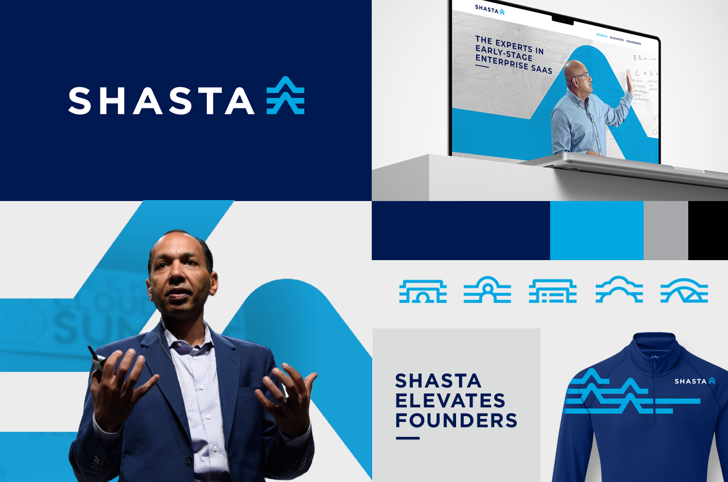
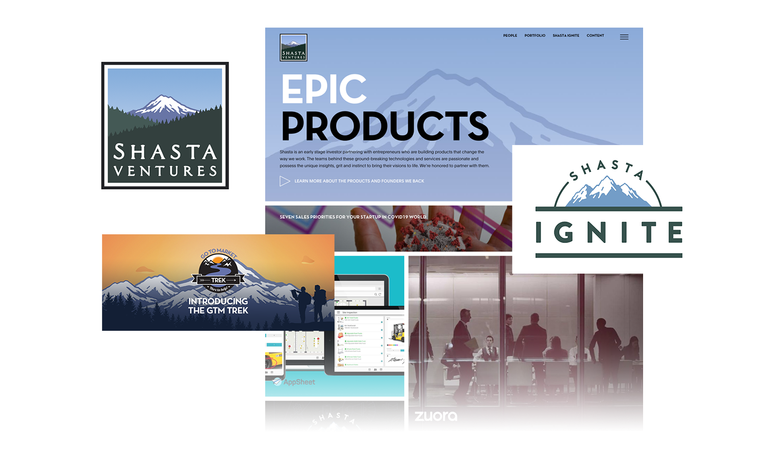
I created the idea to reframe the meaning of Mt. Shasta by focusing on the powerful tectonic shifts that formed the mountain, versus the obvious and generic image of Mt. Shasta. This new meaning expresses the energy, stages and power of tectonic plates to represent a future focused company. The three lines moving upward represent institutional investors providing funding, Shasta in the middle managing those assets and ultimately founders, to back the next successful company.
Result
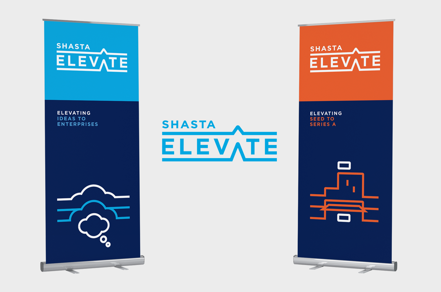
The new identity helped align employees on a shared vision and gave a fresh look to the company. I also designed a new website, defining the UI and UX, and then visual design which I worked with a developer to implement. An event series called "Elevate" was also created to help founders learn and grow.
Work
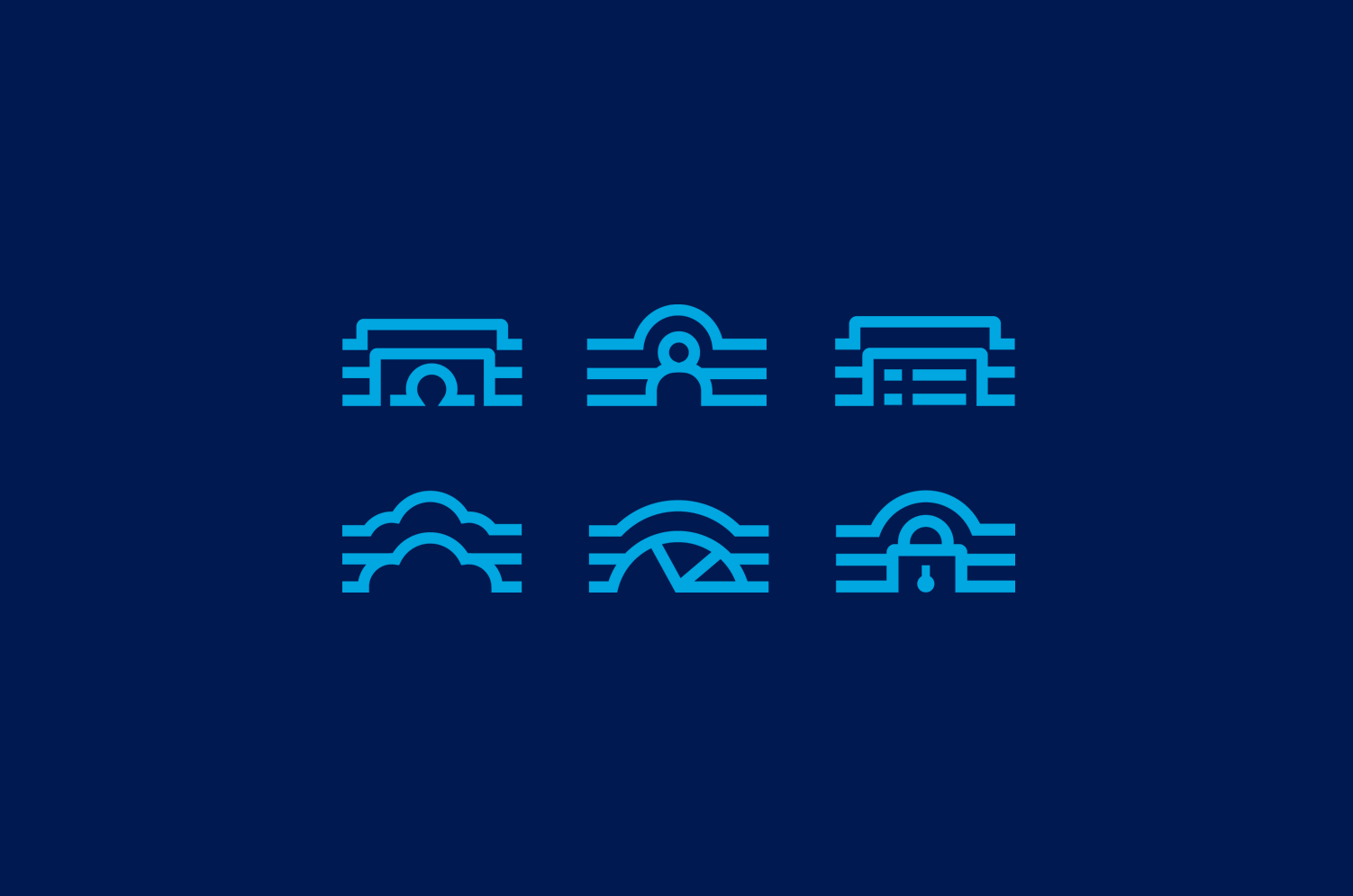
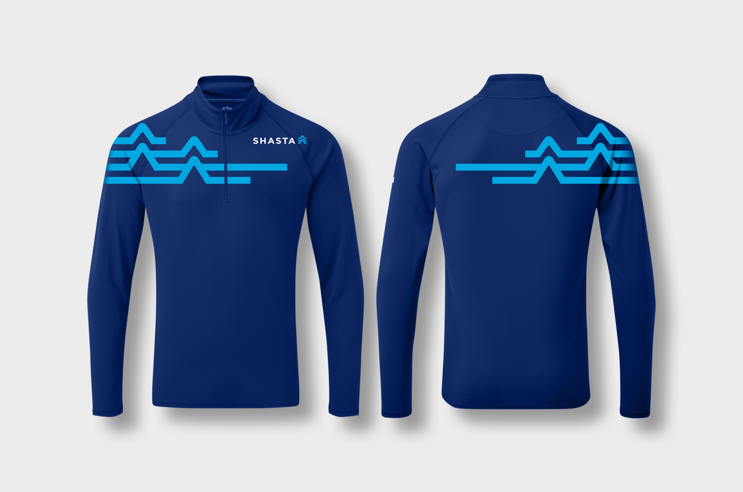
Brand identity / Logo / Website / Icons / Brand Guidelines / Icons / Launch Swag
(Strategy by Great Monday)
Brand Identity
I explored design options that were close-in to their existing logo and concepts that were further out. In seeing these options, the partners at Shasta fell in love with the concept and were excited to make a bold move with a new logo.