Overview
Shaklee's line of nutritional supplements was in need of a refresh to speak to a younger demographic, help consumers pick the correct nutrition for their individual needs and unify the family of products. During the discovery and strategy stage, I discovered challenges with the existing product positioning and proposed a new product tiering strategy all supplements.
Solution
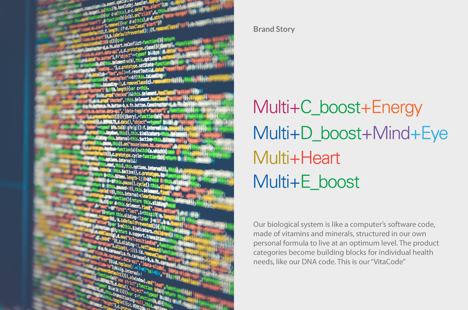
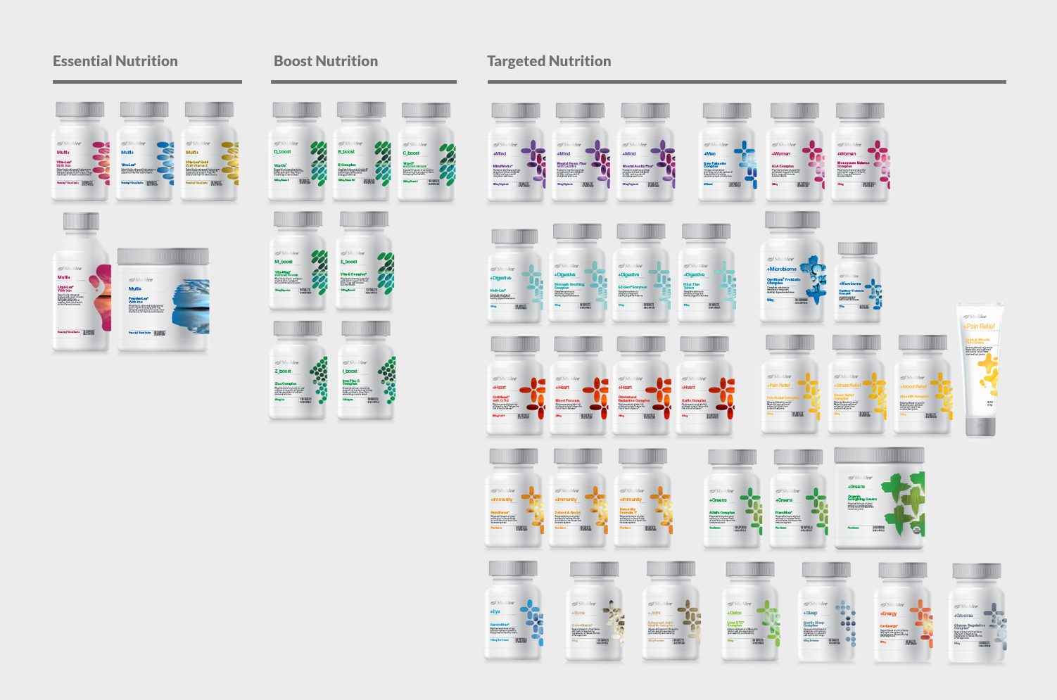
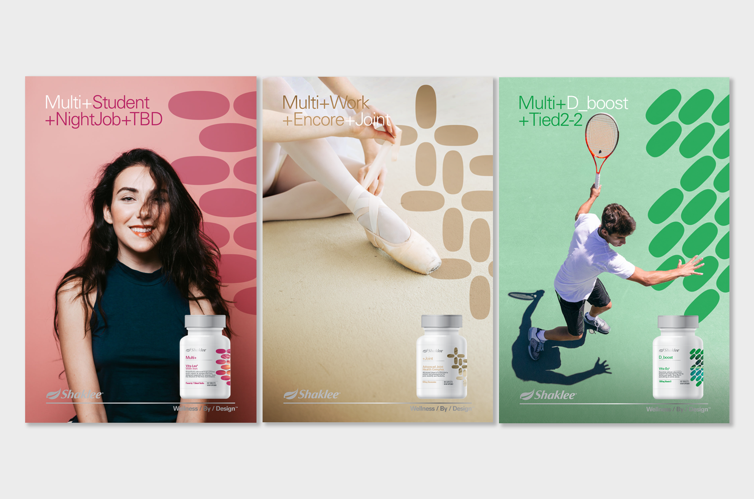
I recommended a three-tier structure that was built on "use" versus "ingredient," which aligned with current trends, and also helped distributors sell products to their customers with a logical and emotive brand story. The design supports a "Nature backed by science" positioning and uses the pill shapes in symbolic patterns to visually group products into Essential, Boost and Targeted tiers.
Results
The new packaging system helped bring a refreshed energy to the company and distributors, and created a roadmap for future products with a clear tiering strategy.
Work
Brand Identity / Strategy / Package Design System / Photo Illustrations / Messaging

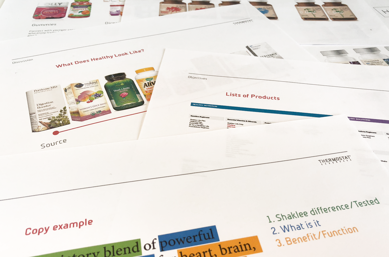
Research and Strategy
I worked with the CEO and CMO to test creative territories and audit the complete product portfolio which we then took to focus groups to test design concepts
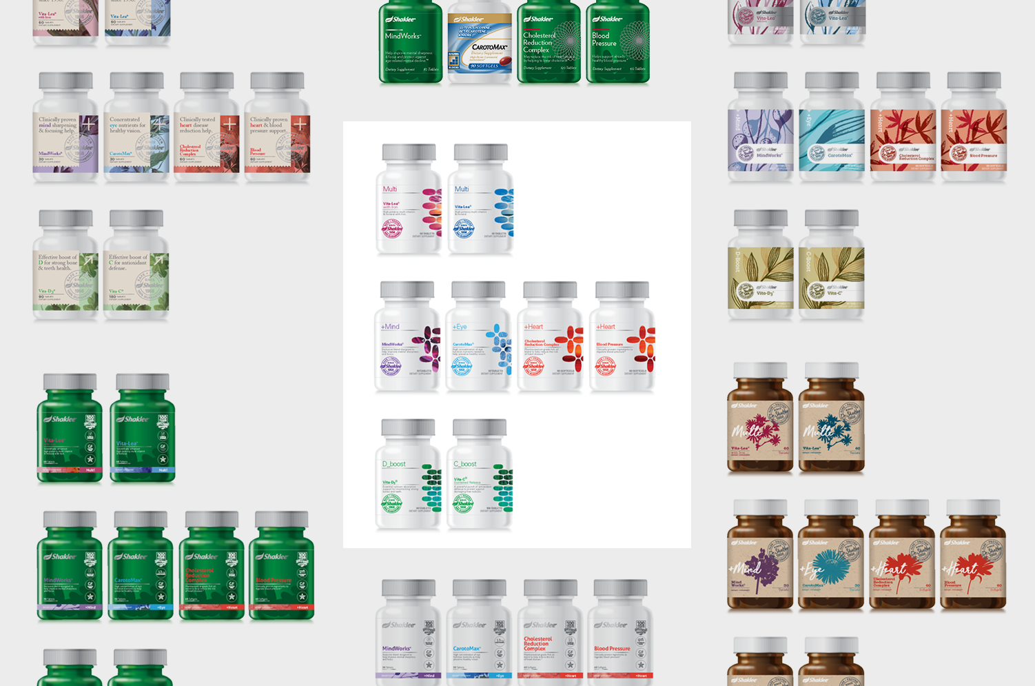
Design System
The packaging system is structured to help distributors read off the label and communicate benefits. The pill patterns contain natural images that symbolize use of products from Macro/sustained nutrition to Micro/Targeted nutrition.

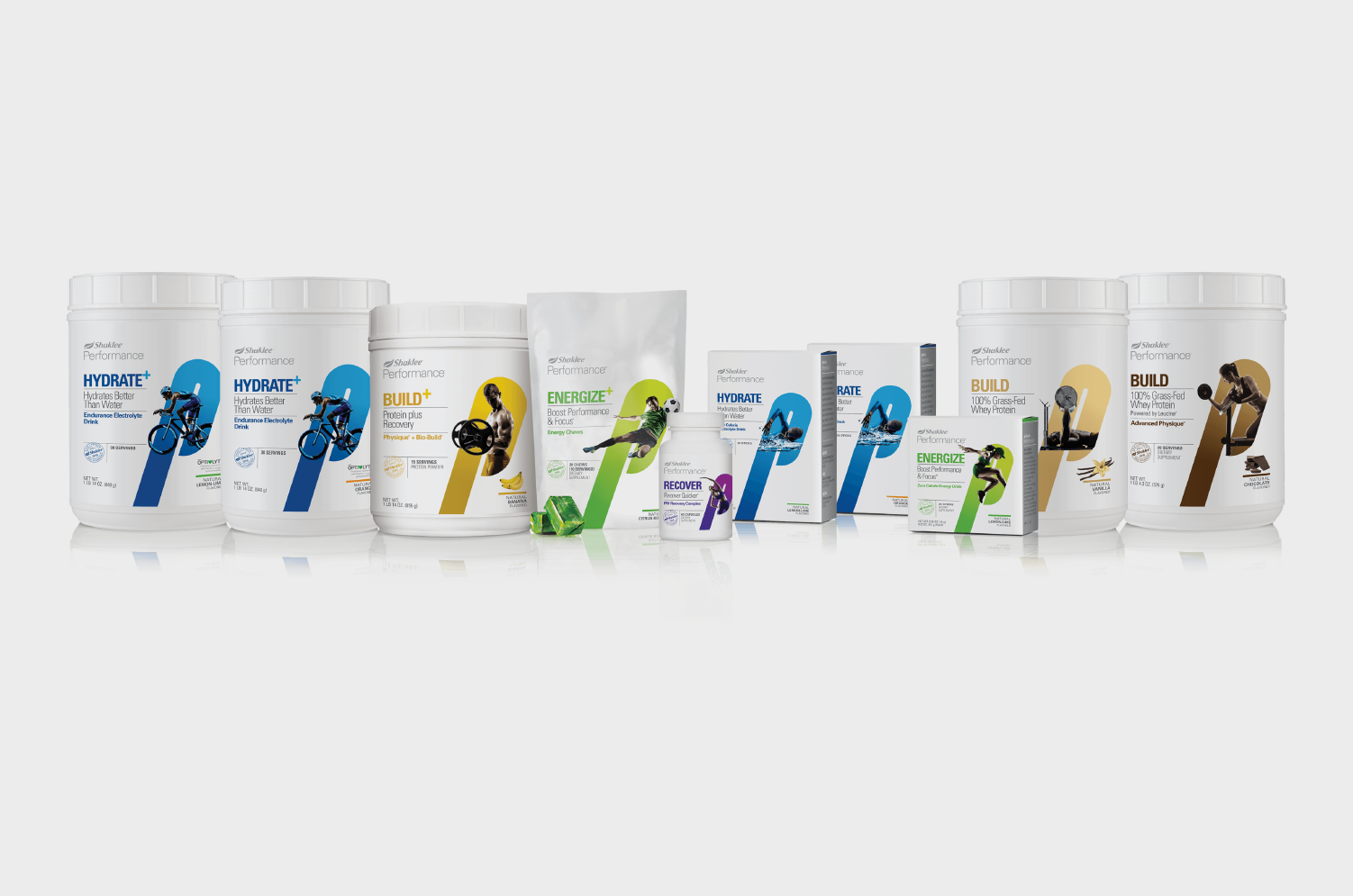
Shaklee Performance Nutrition
Shaklee Performance is a new revitalized nutrition offering for better sports nutrition. I designed a tierring strategy to help position each product within a different stage of working out to aid the consumer in purchasing the correct product for their needs. An energetic letter “P” holds the athlete as they burst out, to communicate the product benefits. This is balanced by a clinical layout to reinforce the efficacy.