Overview
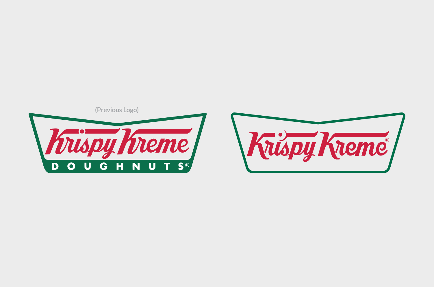
Krispy Kreme came to Sterling Brands to redesign their iconic brand and retail packaging, and explore taking "Doughnuts" off their logo, yet keeping their heritage throughout the brand. I worked with Sterling Brands on the design phase and designed some conceptual work for a rebrand.
Solution
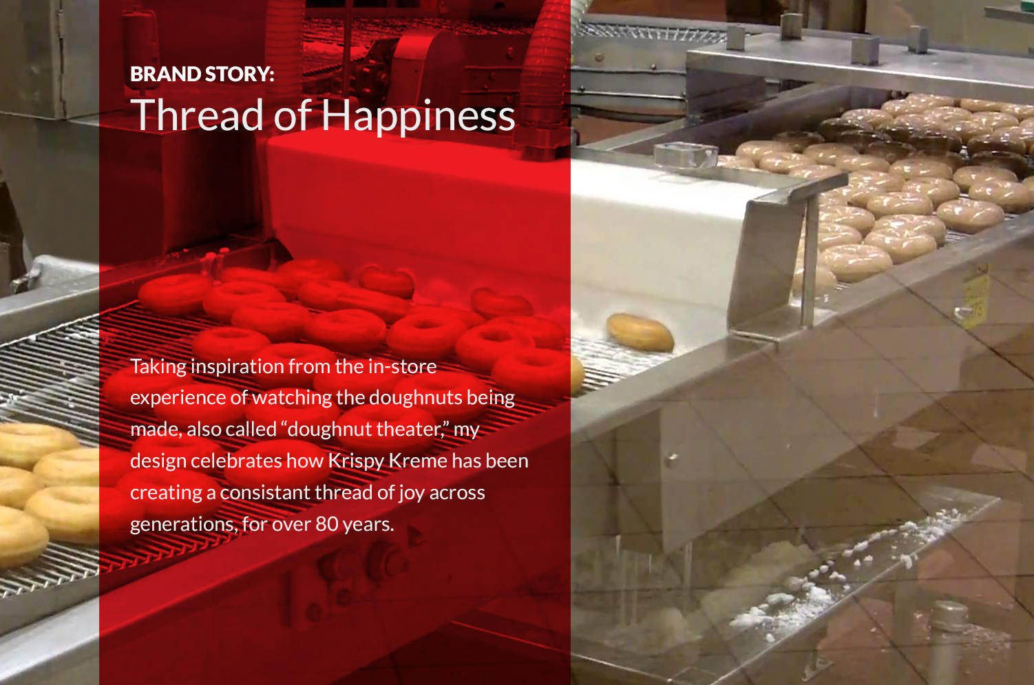
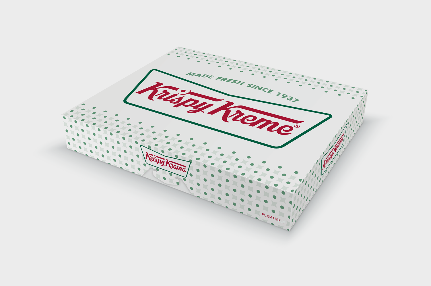
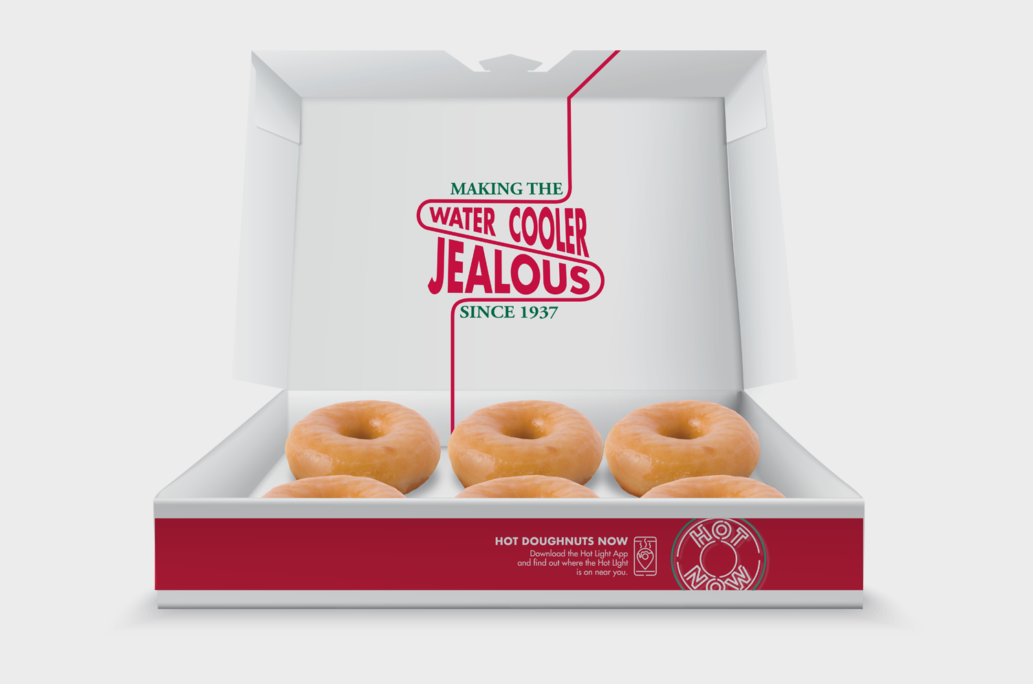
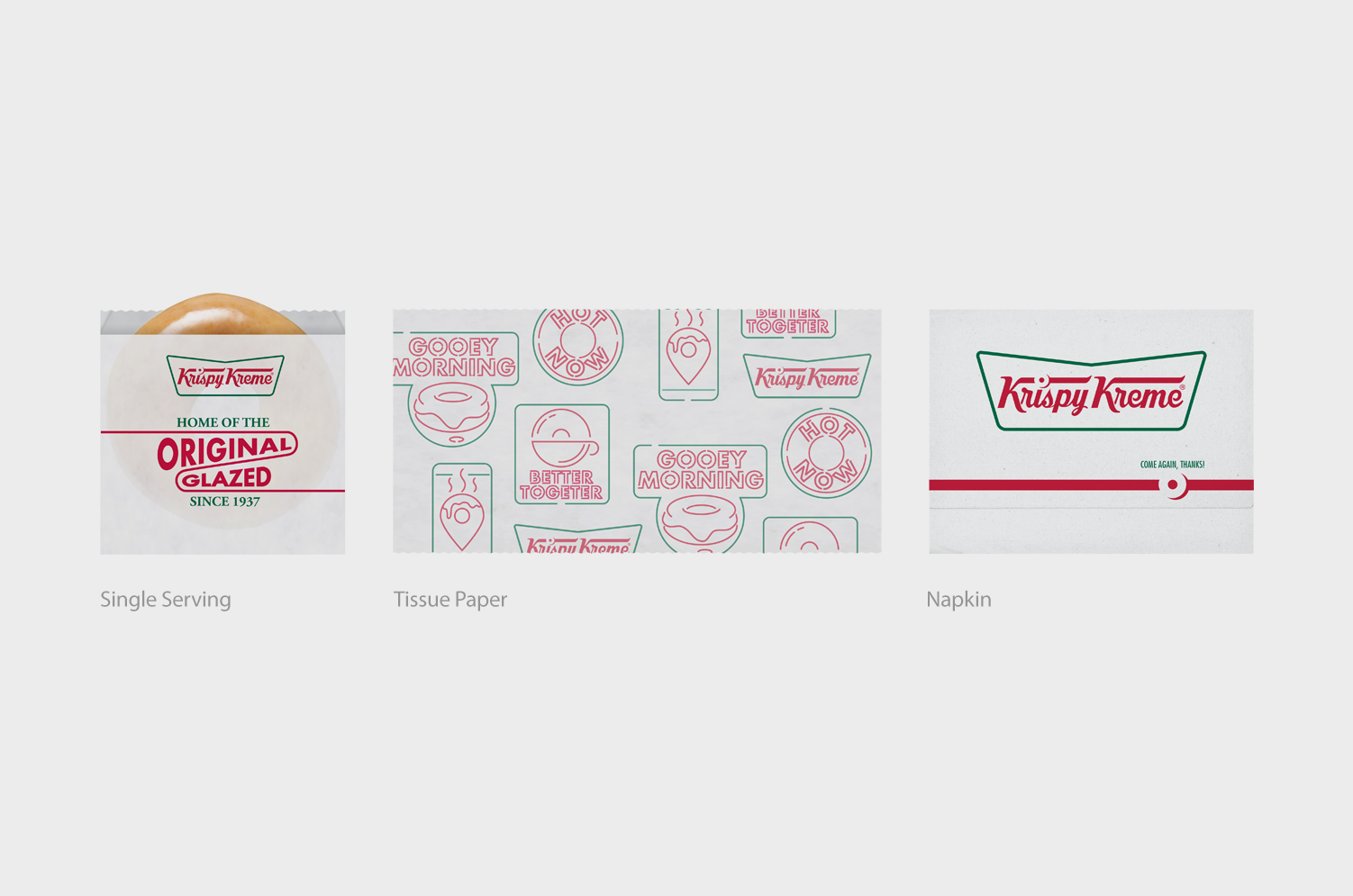
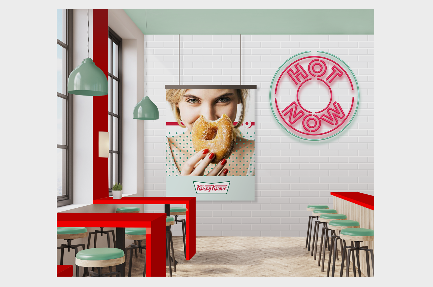
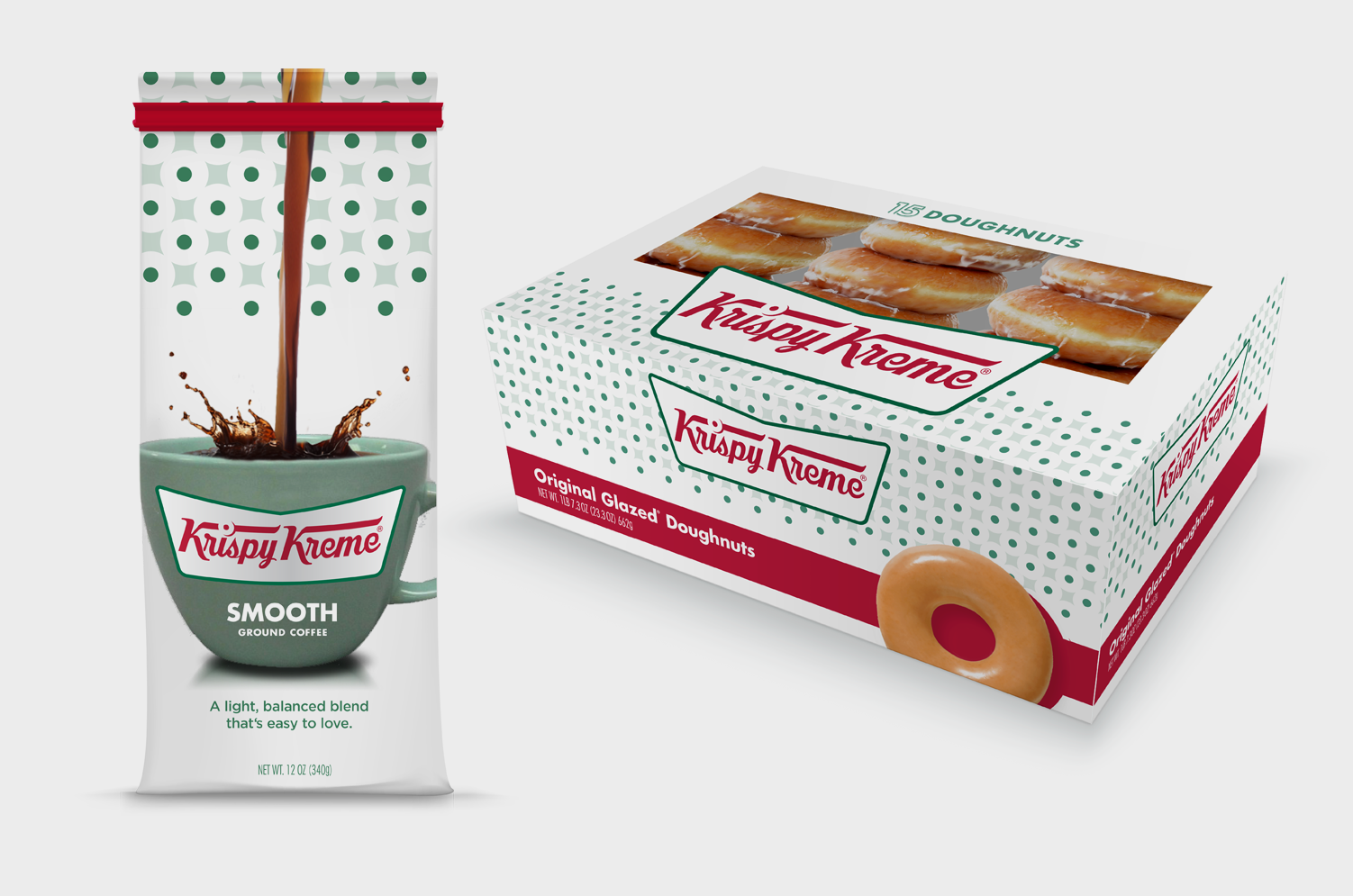
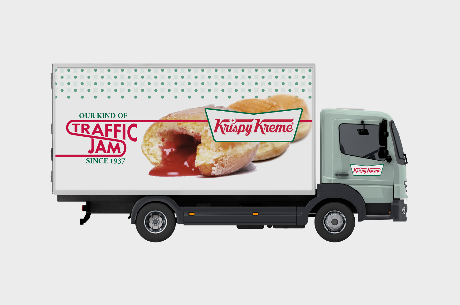
I leaned into an experiential moment at Krispy Kreme stores where customers can watch their doughnuts being made right in front of them, which they call "doughnut theater." In addition I saw an opportunity to refine the logo to be more legible and work at smaller sizes. My concept was to turn the dot over the “i” into a doughnut on a conveyer belt, which represents the in-store experience keeps "doughnuts" on the logo without saying it. The retail packaging provides moments of levity with cheeky messages of their heritage.
Result
This creative work was presented to the Krispy Kreme client and various parts of the design were developed including the illustrations I created on retail packaging.
Work
Brand Identity / Package Design / Icons
(Designed at Sterling Brands)