I have designed new entrepreneurial brands to rebranding industry leading companies. From strategy to implementation, I help companies build brand equity and distinctive brand assets.
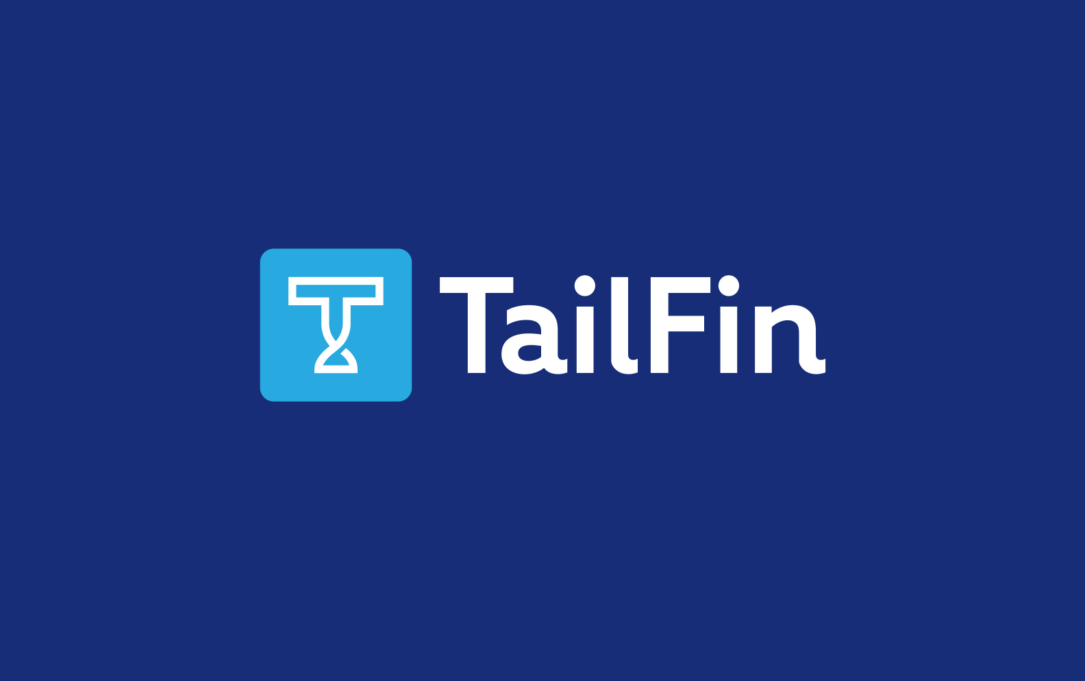
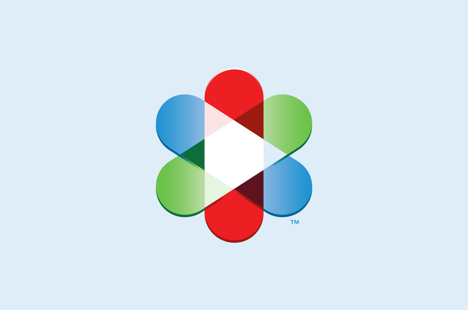
TailFin
Brand Identity Rebrand
Brand Identity Rebrand

A Rebrand that seeks to own a payment niche, all while, creating a unique personality
Overview
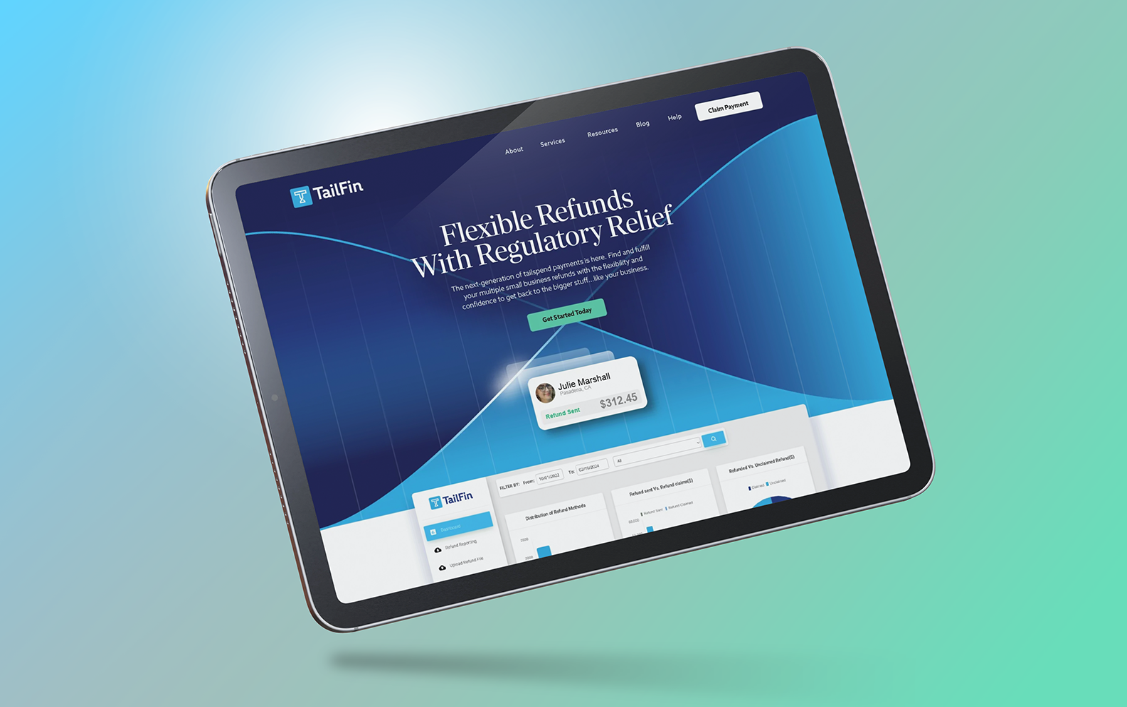
While working with Catchword Branding, I helped their client, "Client Pay Direct" rebrand their identity with Catchword's new brand name, "TailFin". Their mission is to help companies deal with the complex, slow and lost tail spend accounts that companies have to refund, but are a burden and time consuming to deal with.
Solution
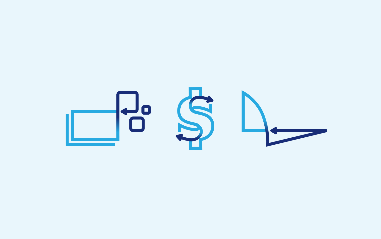
This new name and identity help TailFin position themselves as the platform for tail spend disbursements for health, insurance and finance industries. The logo speaks to the simple and flexible payment automation helping their customers, patients and compliance managers.
Deliverables
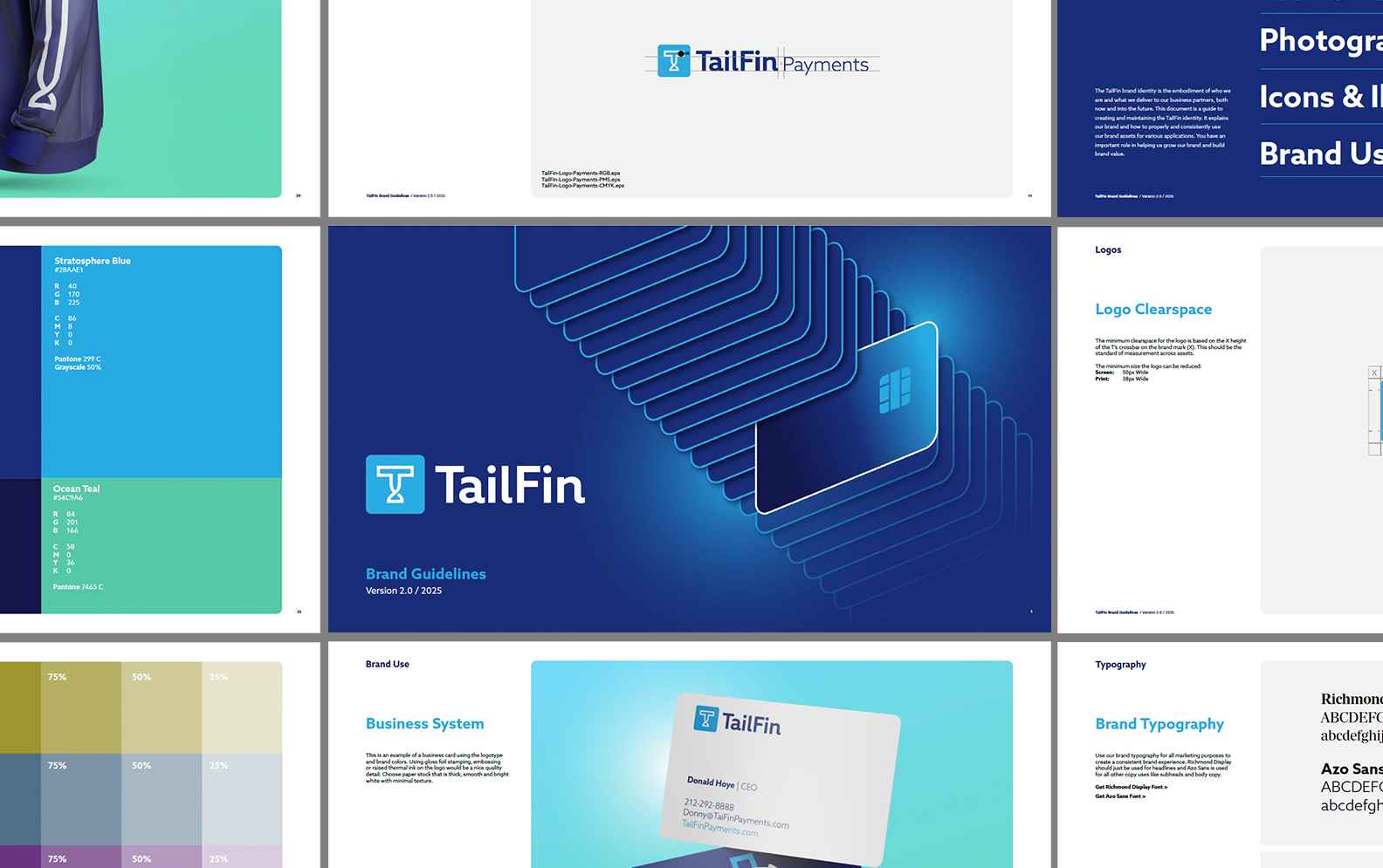
Brand Strategy / Brand Identity / Brand Guidelines / AI Photo Direction
(Designed at Catchword Branding)
(Designed at Catchword Branding)
Temp copy
Rocket Lawyer
LegalTech Rebrand & Brand Management
LegalTech Rebrand & Brand Management

Rebranded & repositioned the legal tech company towards a $223M funding round
Overview
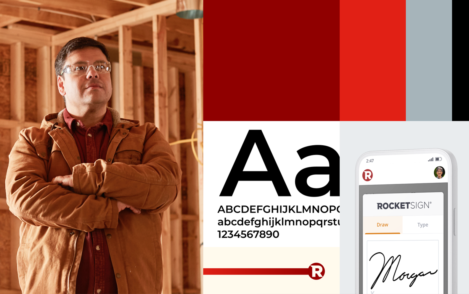
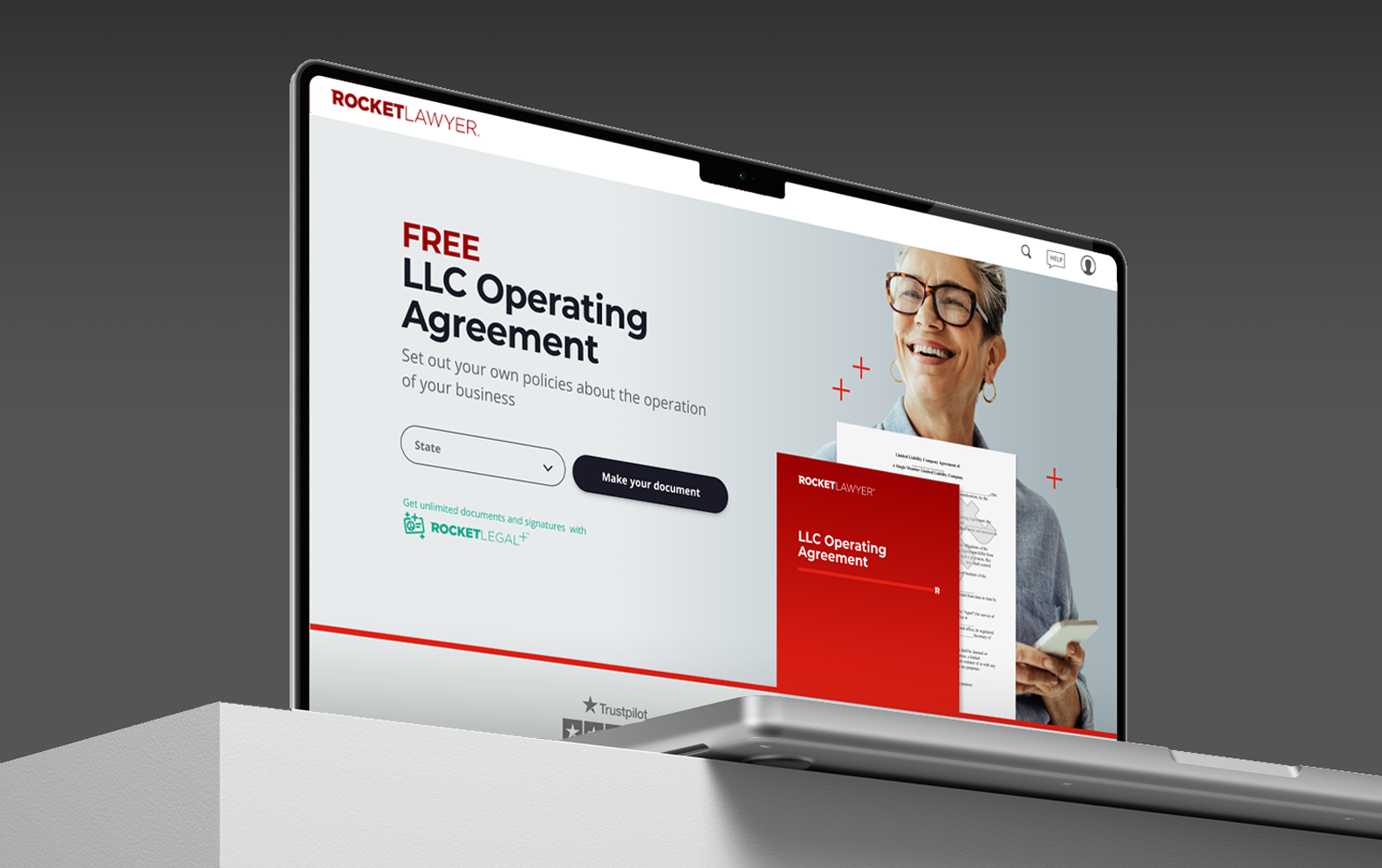
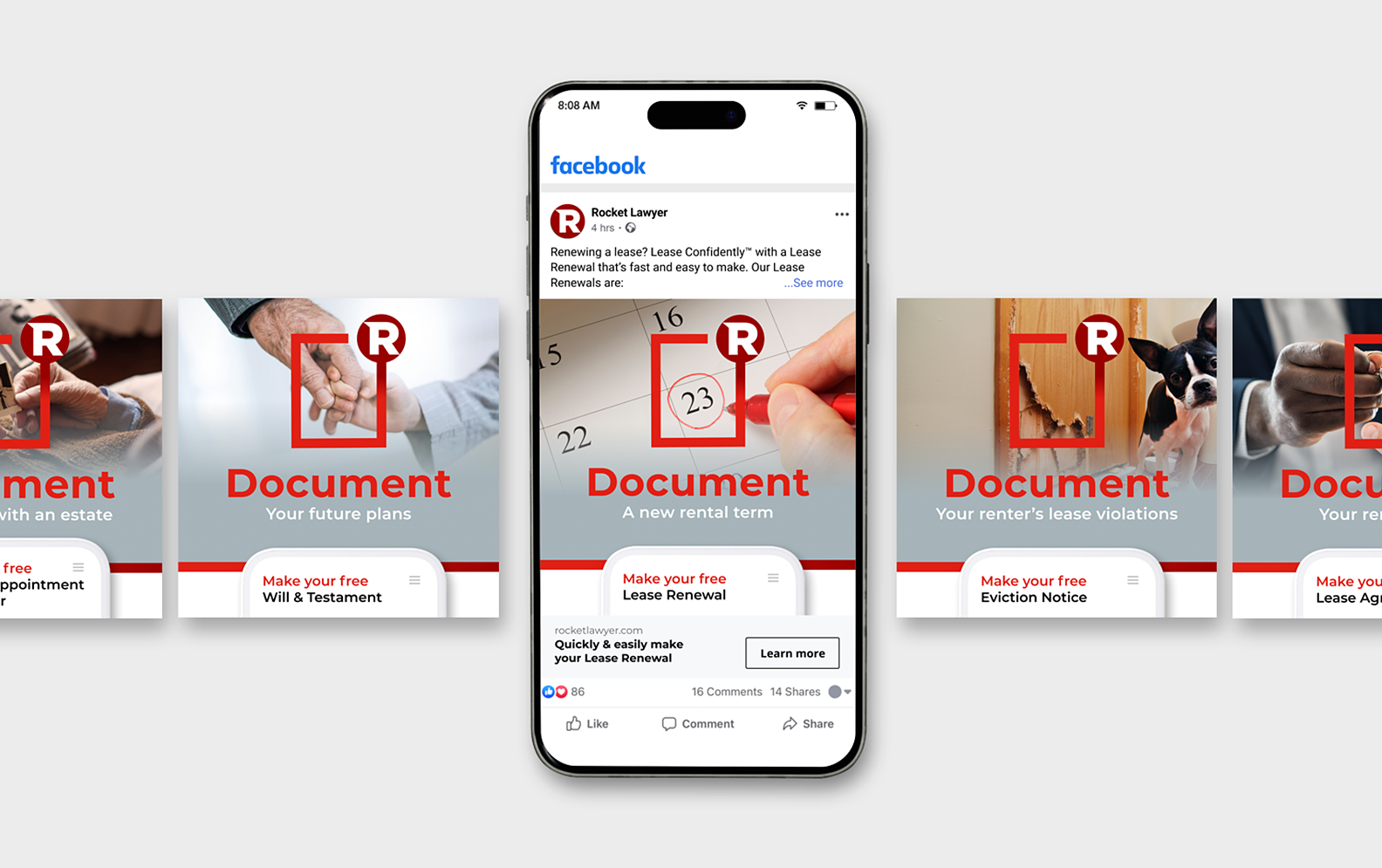
When I joined Rocket Lawyer, I transformed a dated, inconsistent brand into a modern, trusted identity that better reflected its leadership in legal tech and elevated both the product and services Rocket Lawyer offered.
Solution
I spearheaded cross-functional initiatives that redefined our brand strategy; building a clear architecture, refreshed visual design system, and cohesive marketing framework that guided future growth. The work my team and I delivered strengthened market share, elevated product positioning, and helped win back customers globally.
Deliverables
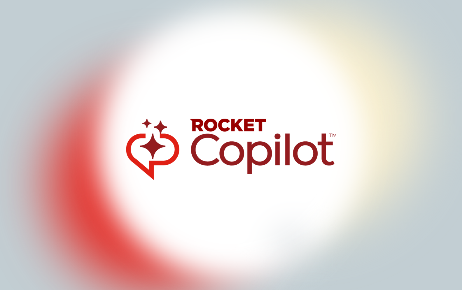
Brand Strategy / Brand Guidelines / Product Brand Architecture / Design System / Employer Branding / Icons / Illustrations / Product Photography / Messaging Guides / Internal Documentation
Spacing
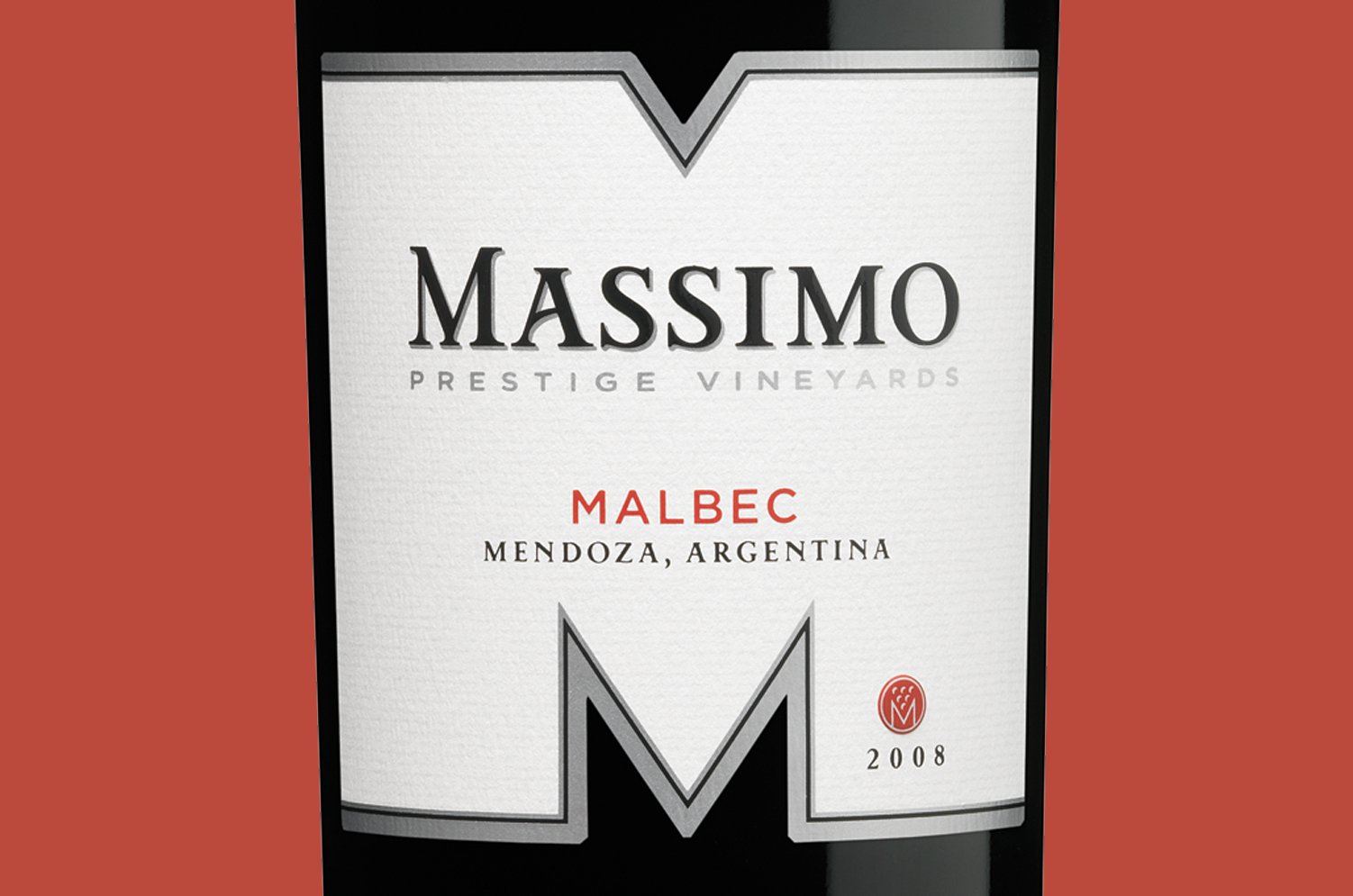
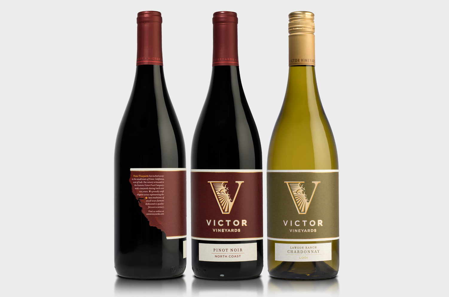
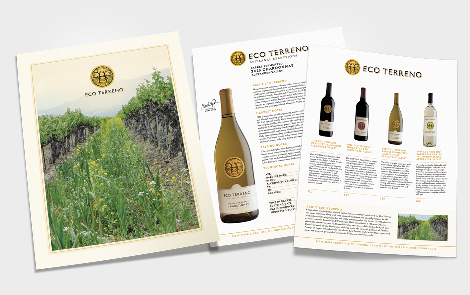
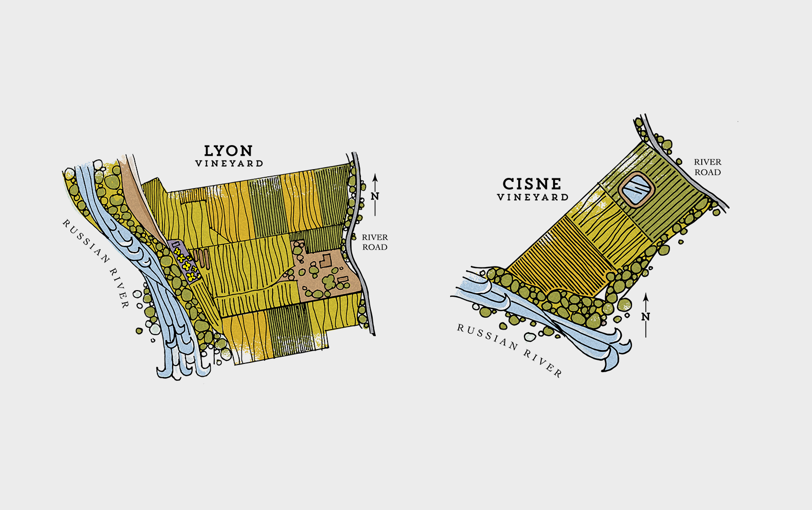
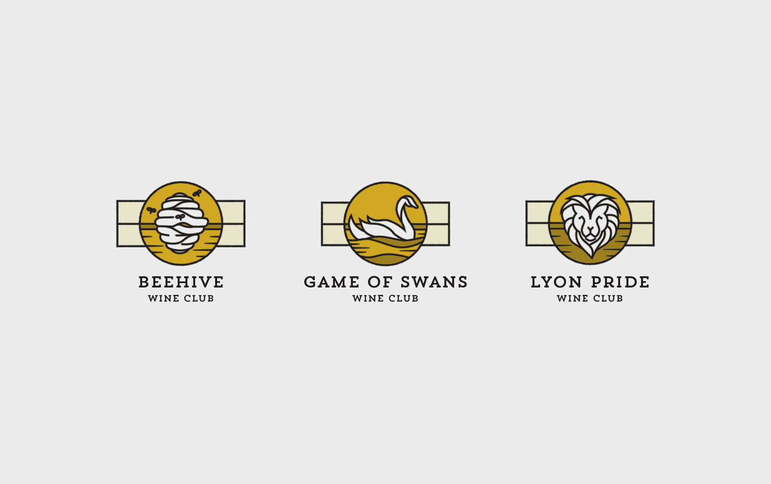
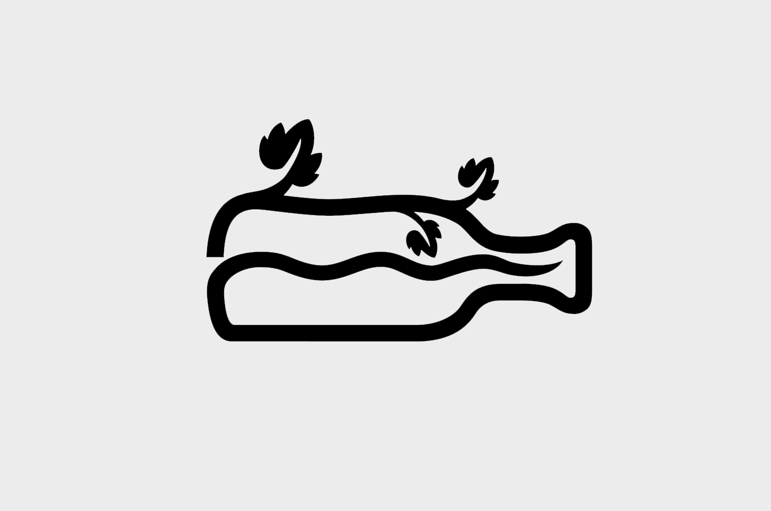
Eco Terreno
Biodynamic Winery Identity & Packaging
Biodynamic Winery Identity & Packaging
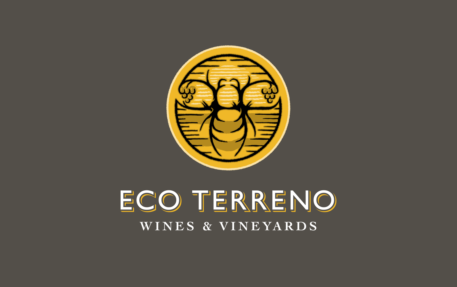
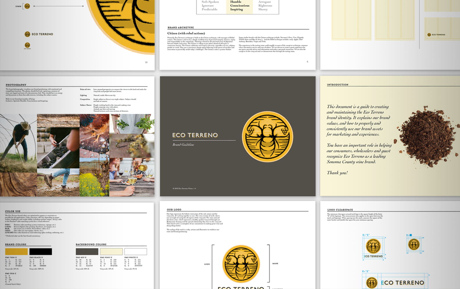
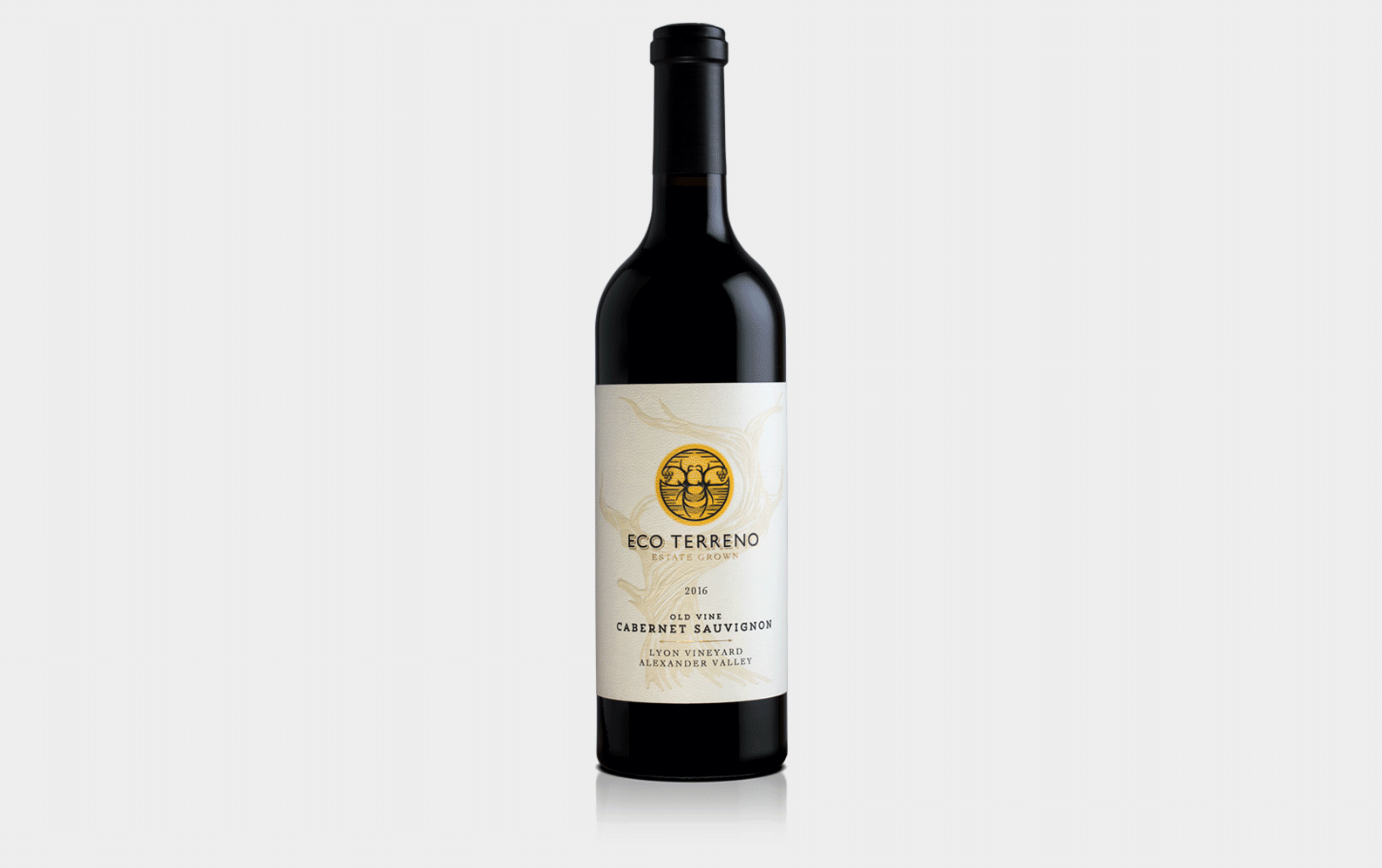
A wine brand that embodies good intentions and great flavors
Overview
Born from Mark Lyon’s passion for winemaking and the land, Eco Terreno embodies his commitment to sustainable, biodynamic farming that nurtures healthy soil and exceptional fruit. Meaning “of the land,” the name reflects both his philosophy and the spirit behind every bottle.
Solution
I designed an iconic bee-shaped mark formed from the land, vines, and air to symbolize the harmony of nature that defines Eco Terreno wines. I also built a cohesive packaging system for both the core and “Artisanal Selections” tiers, positioning a tiered strategy to the wine portfolio. Since launch, Eco Terreno has seen rising distributor demand, expanded sales, and they even opened a San Francisco tasting room to bring its vineyard story to a wider audience.
Deliverables
Brand Identity / Packaging / Brand Guidelines / Sales Collateral / Brand Architecture
Phantom Cyber
AI Cyber Security Brand Identity
AI Cyber Security Brand Identity
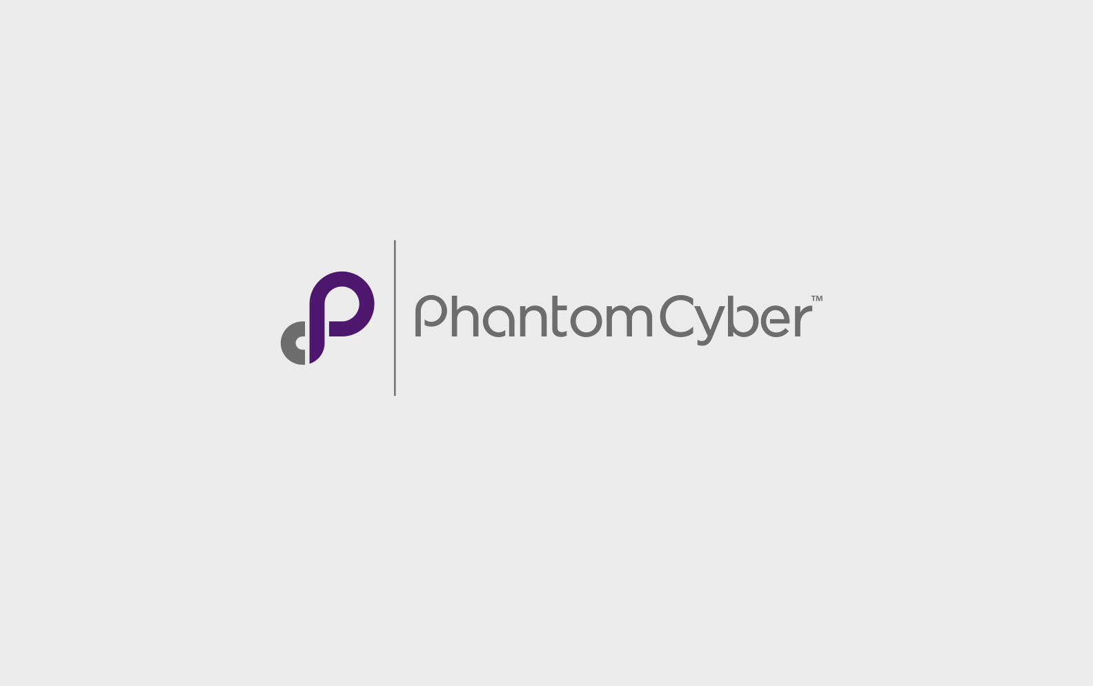
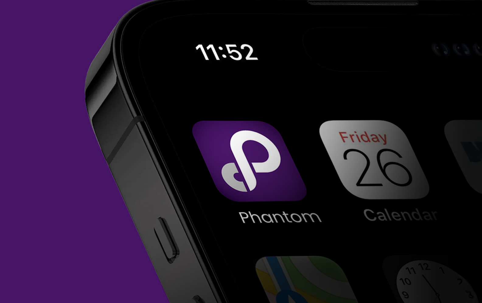
Company was acquired in 2 years of brand launch by Splunk for $350M
Overview
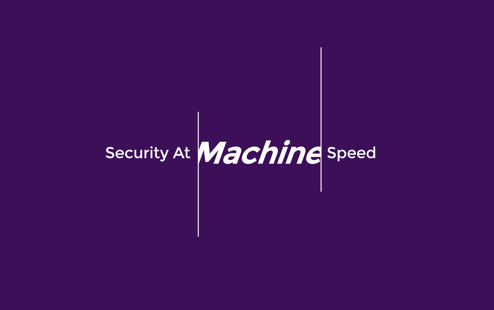
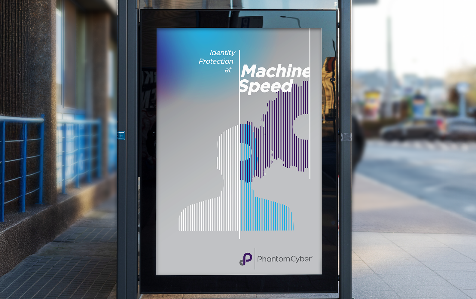
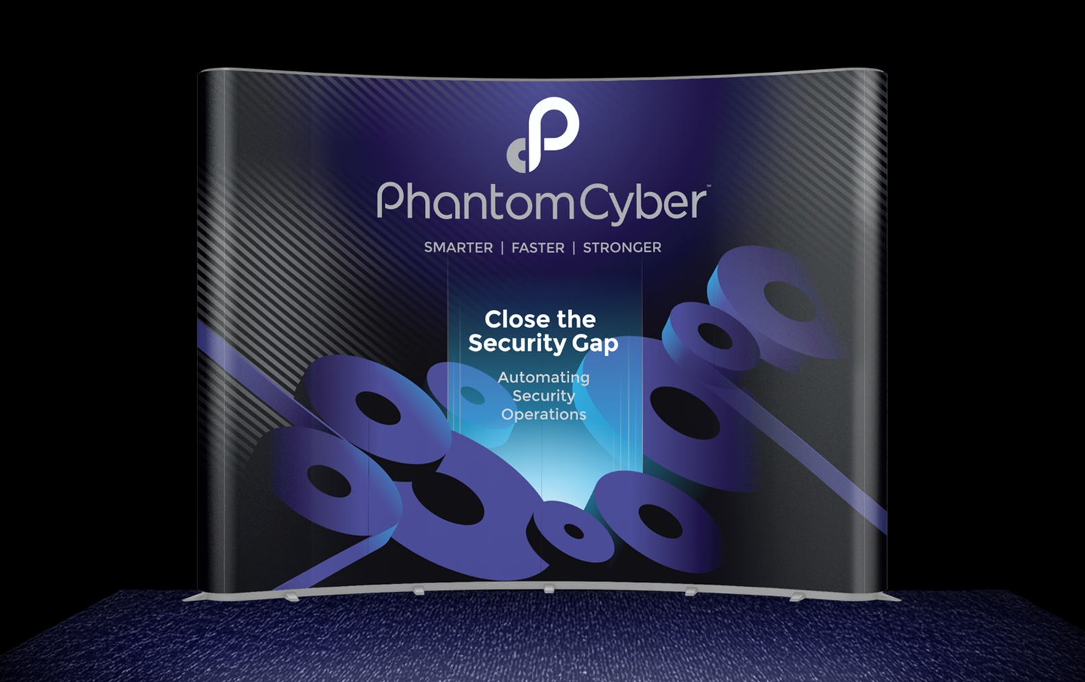
Phantom Cyber is automated online security software helping to move cyber security away from human monitoring and response, to a more automated process powered by AI. Phantom’s product automates about eighty percent of the monitoring seeks out potential threats, to keep up with the increase of computer malware, attacks and identity theft of Fortune 500 companies and their clients.
Solution
I created a bold, simplistic identity that symbolized human potential enhanced by machine learning, and a dynamic “P” reaching outward, searching for threats. This design gave the brand a clear positioning to help the founder accelerate growth and achieve an acquisition by Splunk within two years of launching the brand.
Deliverables
Brand Identity / Brand Guidelines / Business System / Trade show Booth / Swag
Brand Marks & Logos
CPG / SaaS / B2B / Fintech / IT Security
CPG / SaaS / B2B / Fintech / IT Security


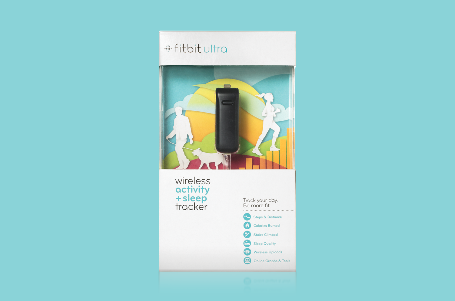
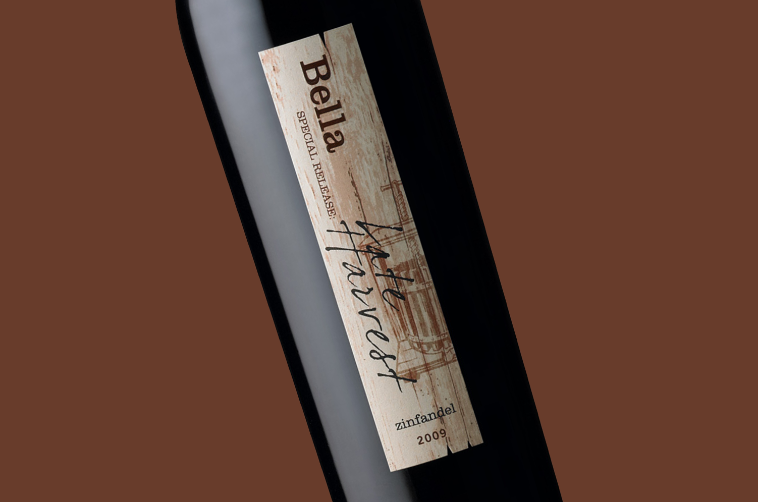
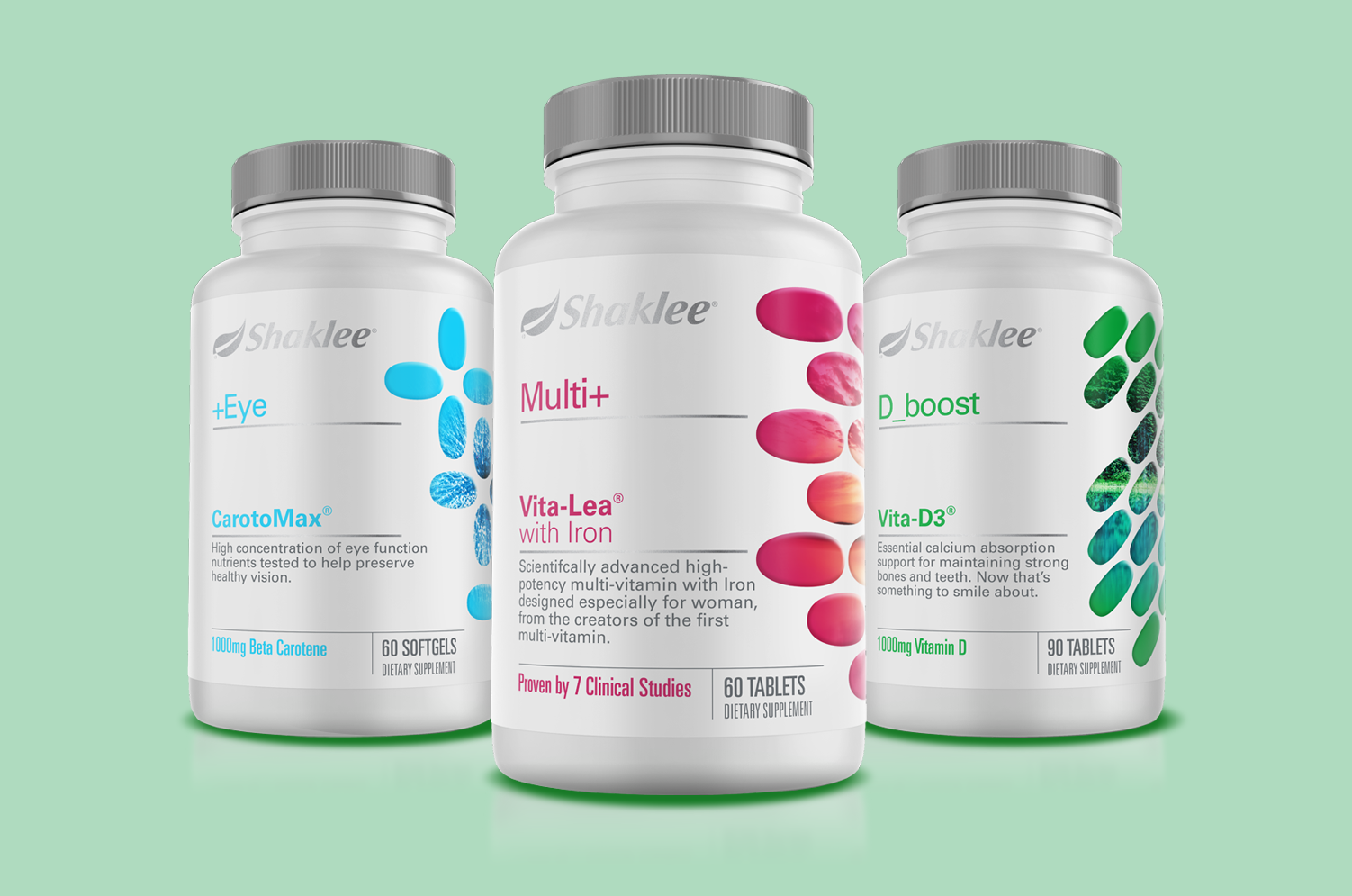
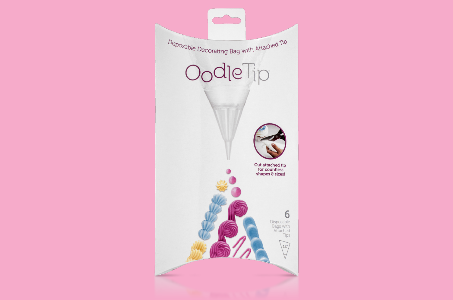
Package Design
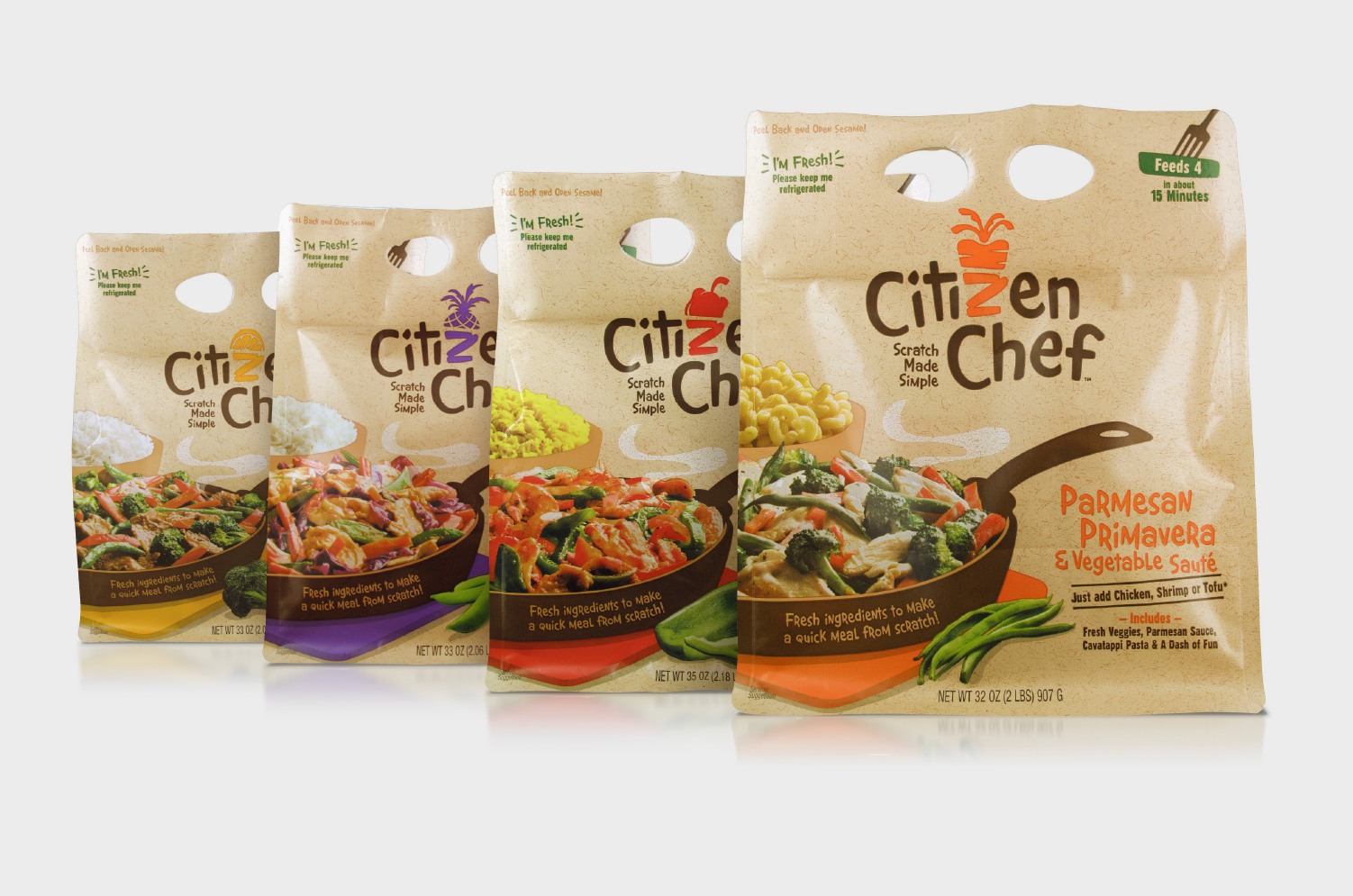
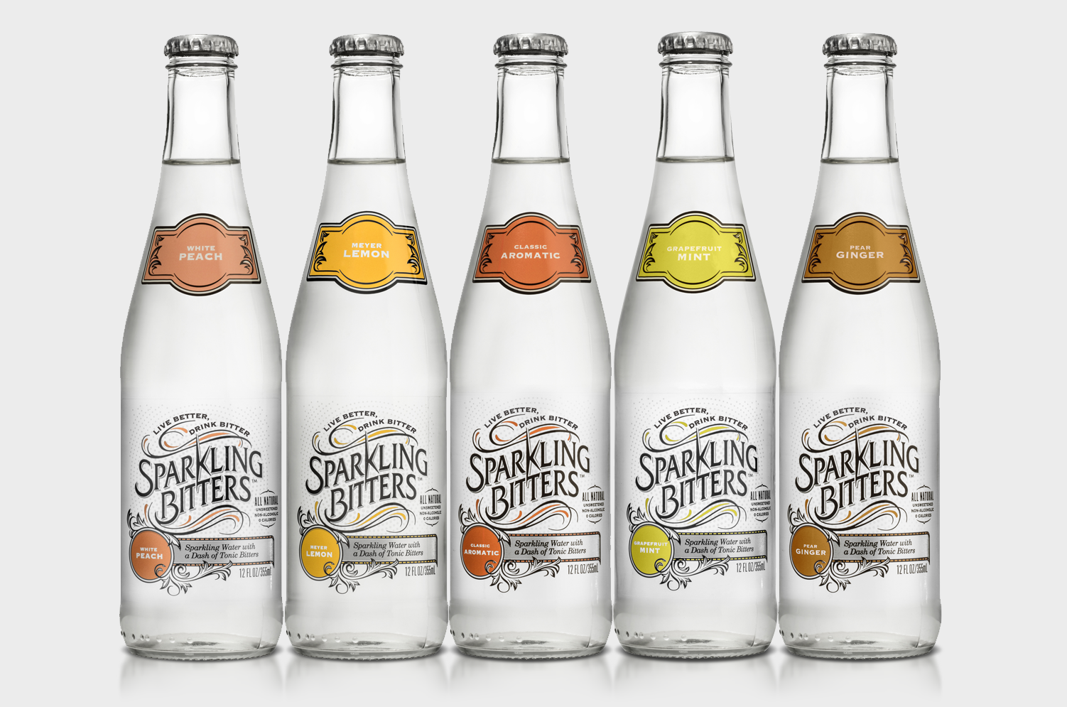
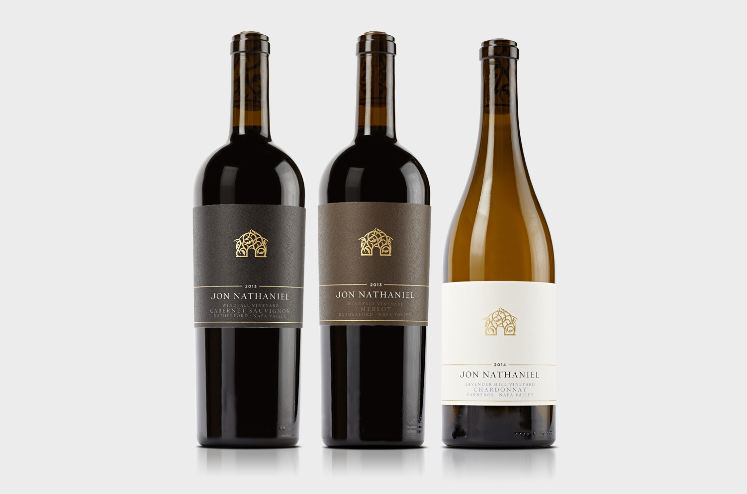
Wine / Food / Beverages / Electronics / Consumer Goods
Wine / Food / Beverages / Electronics / Consumer Goods